A Palette of Possibilities: Choosing the Perfect Render Colour Scheme for Your Home

When it comes to enhancing the exterior of your home, few things make as big of an impact as the choice of render colour. Whether you're renovating, building from scratch, or simply seeking a fresh look, selecting the right render colour scheme can elevate your home's curb appeal and express your personal style.
However, with countless options available, the process of choosing can feel overwhelming.
Fear not! In this guide, we'll walk you through the steps to confidently select a render colour scheme that complements your home's architecture and reflects your aesthetic preferences.
Understanding Your Home's Architecture
Before diving into colour swatches, take a moment to consider your home's architectural style. Different architectural styles tend to harmonize best with certain colour palettes. For instance, a traditional Victorian home might pair beautifully with classic hues like soft creams or warm greys, while a modernist structure might lean towards minimalist shades such as crisp whites or bold, contrasting tones. Understanding this can provide a solid foundation for your colour selection process.
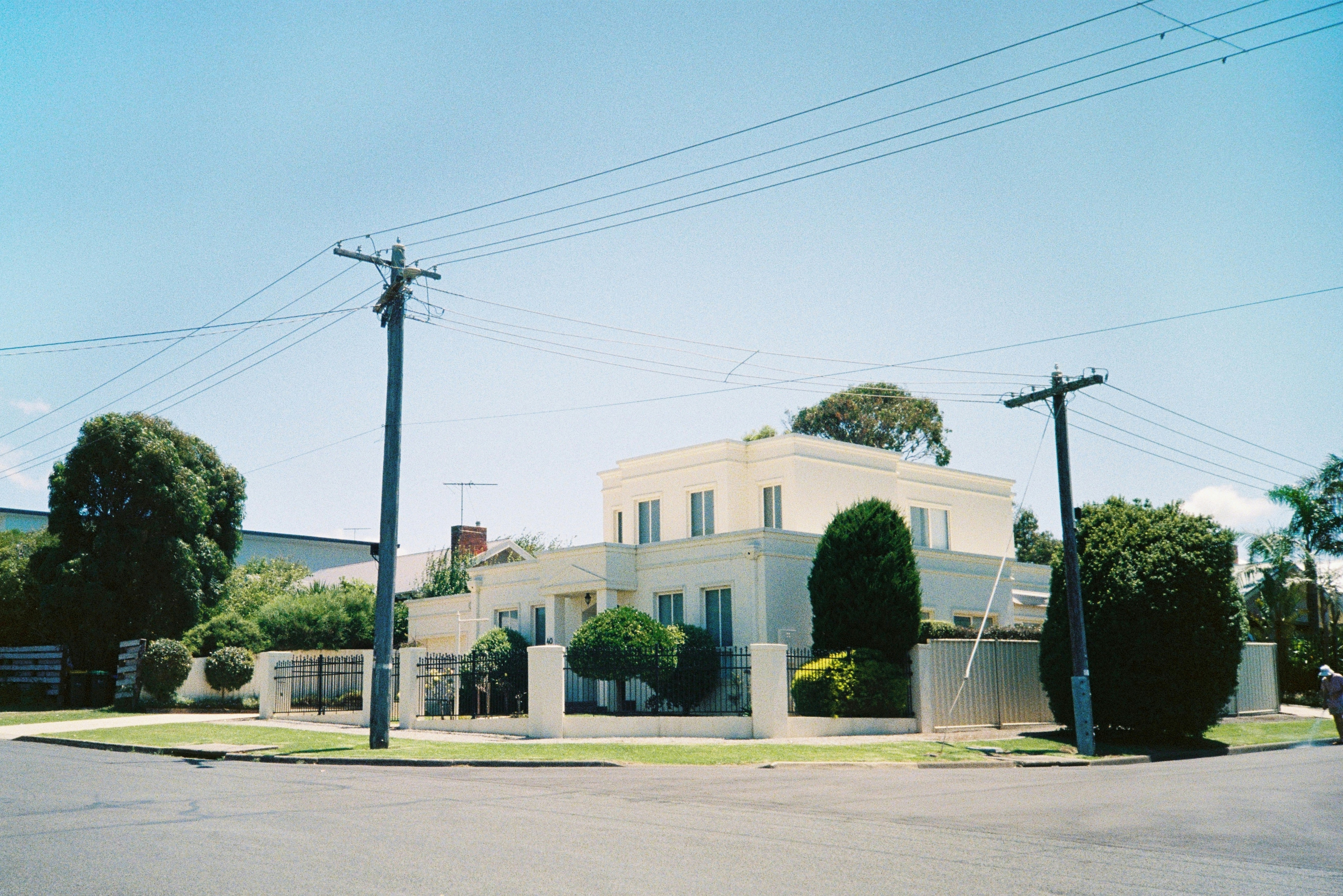
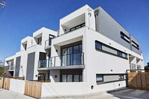
Photo by Cristine Enero
Harmonizing with Surroundings
Take cues from your home's surroundings when choosing a render colour scheme. Consider the landscape, neighboring properties, and any natural elements present. A colour scheme that harmonizes with its environment can seamlessly integrate your home into its surroundings, enhancing its overall visual appeal.
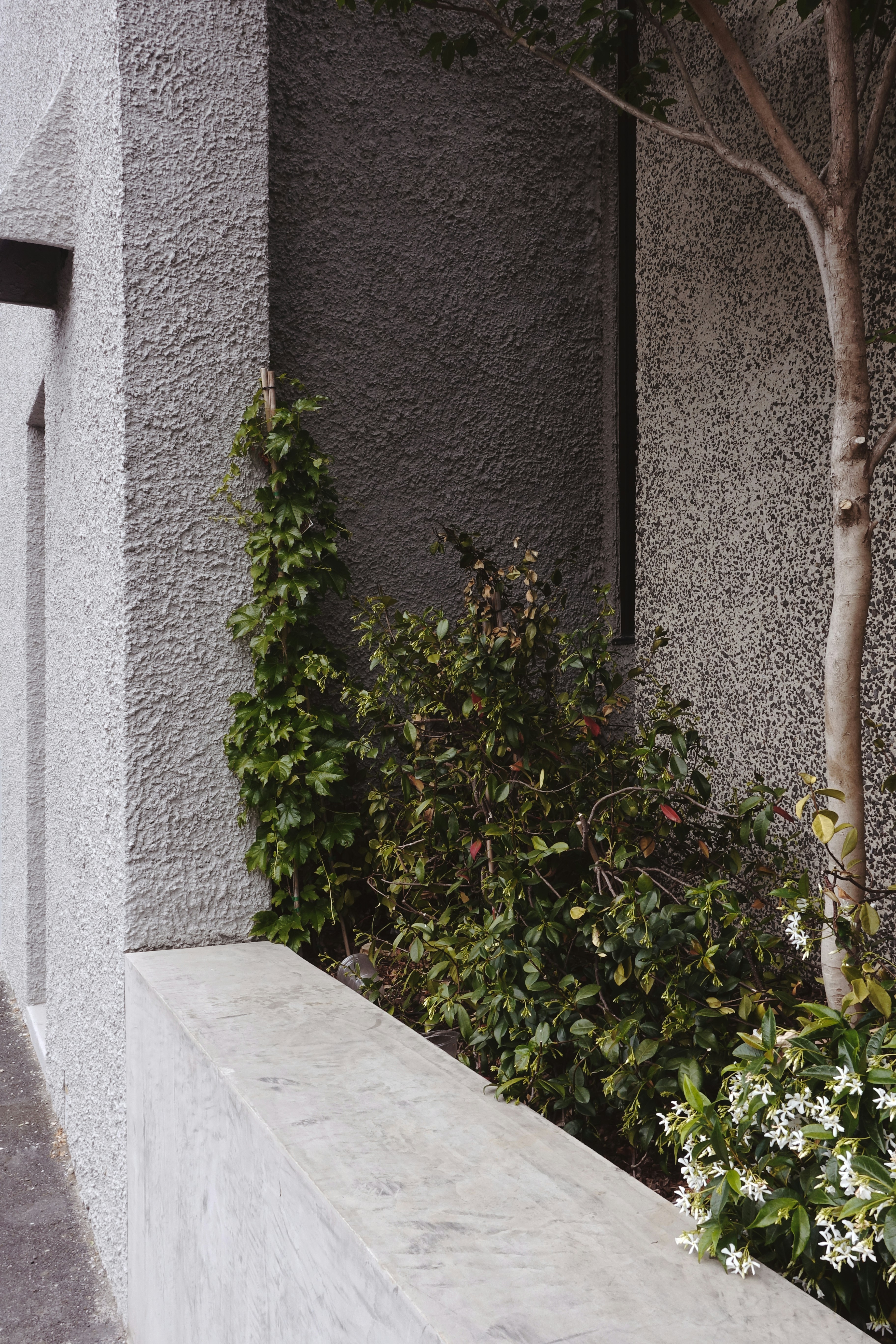
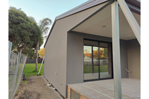
Rough cast/stucco finish (achieve this look with the DTM tyrolean gun). Photo by Joe R Harris.
Considering Climate and Lighting
Climate and lighting conditions play a significant role in how render colours appear. In areas with abundant sunlight, lighter shades may appear brighter and more vibrant, while darker hues can absorb heat. In contrast, regions with overcast skies may benefit from warmer, richer colours to add depth and warmth. Additionally, consider how the render colour will interact with seasonal changes. A colour scheme that remains visually pleasing year-round is key to long-lasting satisfaction.
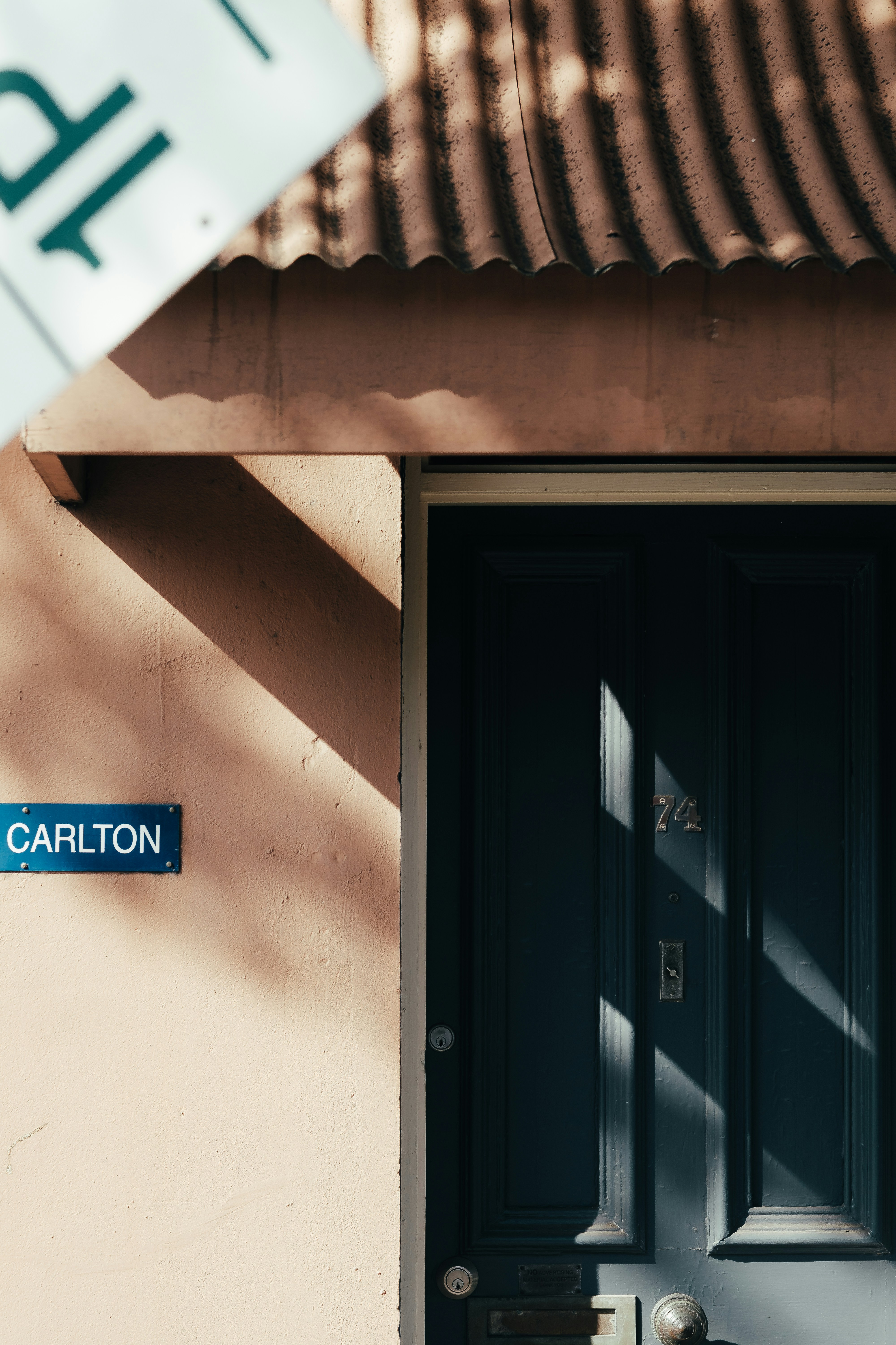
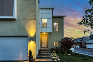
Photo by David Clarke
Exploring Colour Psychology
Colour has the power to evoke emotions and set the tone for your home's ambiance. Delve into the psychology of colour to understand the mood each hue conveys. For example, shades of blue and green can evoke feelings of tranquility and serenity, perfect for creating a calming atmosphere. In contrast, vibrant reds and oranges inject energy and warmth, ideal for adding character and vitality to your home's exterior.
Testing and Sampling
Once you've narrowed down your options, it's time to put them to the test. Obtain samples of your preferred render colours and apply them to a small area of your home's exterior. Observe how the colours appear throughout the day, under different lighting conditions. Pay attention to how they complement existing architectural features and landscaping. Taking the time to visualize your options in situ will ensure that you make an informed decision that you'll love for years to come.
Conclusion
Choosing a render colour scheme for your home is an exciting opportunity to personalize its exterior and make a lasting impression. By considering factors such as architectural style, surroundings, climate, lighting, and colour psychology, you can confidently select a palette that enhances your home's beauty and reflects your unique taste. Remember, the perfect colour scheme is not just about aesthetics—it's about creating a welcoming and harmonious space that you'll be proud to call home